The Valuator
Performance Investor’s Primary Tool
The Valuator: Your Guide To Disciplined Investing & Trading
Watch-list Candidates & Values
Fundamental & Technical Measurements
The Valuator is a monthly publication that provides numerous measurements of stock behavior and “value.” These include the alerts indicator showing which stocks are rising rapidly and have at least 6% or 10% (there are two alerts) to go before reaching the target price, the “Flag” indicators that show where a stock is in its price cycle (all stocks cycle), the “Trends” indicator that maps the direction of 3 consecutive 20-day trends, the “Direction ± (%)” indicator, the “20-Day Low,” the distance in % before a stock reaches its “C.G.” (Center of Gravity), the “C.G” for each stock, PE, Earnings Yield, Dividend Yield, the last Donchian buy/sell signal, Strength Rank, Value Rank (based on a composite of 3 valuation measurements), and Velocity Rank. The online Valuator spreadsheet can be sorted and it gives follow-up information every month.
“Fair Value”, PE, and PEG
People buy high and sell low because at any given time they have no rationale for judging where it is relative to its “fair value.” The price of each stock swings up and down between being “overvalued” and “undervalued” relative to ANY measure of the underlying value (the “fair value”) of the stock. The market’s concept of “fair value” for a stock is not constant. “Fair value” is what the market thinks it is. Like it or not, “fair value” is tied to market sentiment. People use various measurements and ratios to express “fair value” and those metrics give a sense that fair value is something that can be quantified. However, “fair value” always has a context that in some way shapes the meaning of “fair value.”
For example, one year a company may generate earnings of $2 a share. During that year, the price of the stock ranges between $30 and $40. Another year the stock generates earnings of $4 a share. During that year, the stock’s price ranges between $25 and $30. If you have watched the market for any length of time, you will know that this kind of thing happens frequently. Why isn’t there a better connection between “fair value” and earnings? The same thing occurs if your “fair value” measurement is based on book value, PE ratios, price-per-sales ratios, PEG ratios, dividends, earnings yield, or whatever. “Fair value” is what the market says it is. It is always changing with the successes and failures of the company (or sector) and in accordance with how people judge those successes and failures. New healthcare legislation is passed and the value that the market places on healthcare stocks changes. Also, the fair value of $1 in earnings generated by a tobacco company was different in 1950 from what it is now. Also, the fair value of $1 in earnings generated by a tobacco company is different today from that of a computer chip company today.
With regard to earnings estimates, a study of more than 67,000 estimates conducted by David Dreman determined that 45.3% of the estimates missed actual earnings by more than 15%. However, that 15% variance works both ways. Suppose one stock analyst estimates 15% more than the actual figure turns out to be and another, looking at the same stock, estimates 15% less. The measurements you use may vary by 30% from the measurements used by someone else. You may be reaching entirely different conclusions about the same stock depending on which analyst you are using. While we provide some fundamental measurements by analysts, we primarily use probability-based algorithms in determining the price of highest probability rather than “Fair Value” Instead of thinking in terms of “undervalued” and “overvalued” relative to “fair value,” we think in terms of “underpriced” and “overpriced” relative to the “price of highest probability,” the price about which the stock oscillates, or, its “Center of Gravity,” its “C.G.” The C.G. may be quite different from “fair value,” but it is the price the stock is most likely to revisit soon.
The Need For A Discipline:
You cannot monitor all stocks. Therefore you must focus. Develop strategies, systems, and disciplines that will enable you to find “setup” situations. Develop a discipline for finding stocks that are attractive and timely technically.
The Valuator is a resource and research tool for traders and investors that is specifically designed to enable its readers to develop a disciplined approach to investing. It is also intended to be useful in the implementation of that discipline. Implementation of a disciplined approach to investing requires regular follow-up information on stocks that have been selected for inclusion in a portfolio. That is why a relatively large and stable list of stocks is monitored. The Valuator is a publication that tracks approximately 500 stocks on a regular basis (the typical market newsletter covers only a handful of stocks with almost no follow-up reporting). If a company is absorbed by another company, its stock will be replaced. The same is true if a company loses it listing. However, our general policy is to continue tracking a stock until we feel it is necessary to drop it.
The Valuator is different not only in the quantity and quality of data it provides, but also in the fact that its data can easily be sorted and sifted by users. This should open a portion of an old Valuator. Once you open the spreadsheet, try printing it. Then, copy it to your own spreadsheet program. You should be able to “massage” or sort the data in your own program. If the sample you see is larger than your screen, press the “Ctrl” key and the “-” key at the same time to reduce the size of the spreadsheet. If you have trouble pasting into your own spreadsheet, it’s probably because of the merged cells in the headings. Try copying and pasting only the rows of data below the headings. If you want the headings, you can add those to your spreadsheet later. Then, you could use the same headings or subsequent issues. Sorting and sifting should make it easy to find the stocks that best satisfy the particular requirements of your discipline. You also have our permission to print your own hard copy (for your own personal use only) if that is your desire. For your convenience, we have pre-sorted the stocks in four categories and provide a list of the top-ranked 38 stocks in each of those categories. We believe a subscription provides much more real information for the price, than you could get by subscribing to perhaps any other “market letter” on the planet.
Basic Facts You Should Know
People buy high and sell low because a stock is constantly swinging through its cycles and at any given time they have no rationale for judging where it is relative to its “fair value.” The price of each stock swings up and down between being over-valued and under-valued relative to ANY measure of the underlying value (the “fair value”) of the stock. The time it takes from trough to peak averages about 6 months, though individual stocks can vary greatly from the average. Even the “fair value” of a stock is not constant. It is always changing with the successes and failures of the company and in accordance with how people judge those successes and failures.
We get ideas through the media that may have been great when first conceived, but by the time they get to us, it may be too late for an individual with limited resources to take an initial position. For example, the money manager touting a stock on television may have been buying his “best pick” for several months (buying most of it when the stock was fifteen dollars cheaper), or the stock idea in Forbes may have originated weeks before publication.
Discovering “fair value” is a complex matter. Stock prices have little to do with the current “intrinsic” value of a company (the total net value of a company’s assets divided by the number of its shares). Even if a stock is priced at $30 and its “fair value” is $70, it may take a year or two for the share price to get there. We don’t have the time to sit around for a year or more only to find out that the company has a new competitor that offers a better product or service at a better price, or that its potentially blockbuster drug has failed its final round of human trials. So, we want a more reliable model for finding profit opportunities. Instead of analyst reports, we look at the pattern of movement of a stock. Think of a trampoline. Imagine looking at it, aligning your eyes with the edge of the frame that holds the canvass with springs placed around the inside of the perimeter. From the side, the frame forms a straight horizontal line. Now imagine a person jumping on the trampoline. His feet push the canvass below the frame, and when he bounces, his feet rise above the frame. Now imagine the pattern of his feet only. They oscillate above and below the straight line of the frame as viewed from the side. A stock’s pattern is similar, in that the price will oscillate above and below its average, or “center of gravity,” the focal point of its oscillations. A stock may be above or below its “fair value,” but wherever it is, it will still swing above and below a significant moving average.The moving average is, by definition, its average price, the price of summation of all its variations, and the price to which the stock will return with the highest level of probability.
The risk of decline increases as a stock rises, especially if it rises above its “C.G.” As the premium above the C.G. increases, the greater the probability of a decline. Thus, it makes sense to plan your purchases so that you can be satisfied with a sale at or below the targeted C.G. price. For example, the “% TO C.G.” column shows the gross profit potential of a stock if it is bought at the “RECNT PRICE” and sold at the “C.G.” price (there is no guarantee that it will actually reach the “C.G.” price). There is only the probability that it will do so.
How Can The Valuator Be Used?
It was designed to enable the user to create his or her own strategies and to assist in the disciplined implementation of those strategies. It is intended to facilitate stock screening. The 500 stocks covered underwent some vetting before their inclusion in The Valuator (perhaps 90% are members of the S&P large-cap, mid-cap, or small-cap index). There is not enough space here to describe all the ways it can be used. As a screening tool, The Valuator can help you close in on the final picks for your watch list. We will offer just a few ideas here. Hopefully, that will open your thinking to many other ways of using it.
► Any stock with a right-pointing arrow is not only considerably underpriced relative to its C.G., but it is also rising faster than the average of the rising stocks (undervalued or not). A person could monitor these stocks until one is offering a good entry point. That is, it has either pulled back to a rising trendline or moving average and has “bounced” off that trendline or average because of the buying support that exists there. The investor could then sell when a volatility-adjusted stop-loss is triggered, when the stock has declined a certain percentage below the purchase price, when it reaches the “C.G.” figure that generated the alert arrow in the first place, or through the implementation of some other sell discipline.
► A few years ago, the “Dogs of the Dow” system received notoriety because of the great returns it achieved over many years (about 18% average per year for 15 years). The strategy involved selecting the 10 Dow stocks out of 30 that have the greatest dividend yield. They are bought and held for one year. At the end of the year, the Dow stocks are ranked again according to their dividend yield. Adjustments are then made to the portfolio to align it with the new ranking. That is, the stocks that no longer offered enough of a dividend yield to place them in the top ten ranked stocks in percentage yield were sold and those that replaced them in the top ten ranking were bought. Again, adjustments are made only once a year. The thinking was that these companies were healthy enough to pay a dividend and that they were probably underpriced because the yield goes up when the price goes down. They were also considered relatively safe because the Dow is made up of some of the biggest blue chip companies in the world. Therefore, the fact that prices are low for the high yielding stocks was probably not due to a pending bankruptcy. The Valuator covers stocks in the Dow plus many other “blue chips.” In The Valuator, the 38 top ranked dividend-paying stocks are listed for you, but a larger list can be created easily by selecting all the data cells of the spreadsheet (except the headers) and sorting it by the dividend yield column. The top 10 stocks in the Dow are in the top 33 percent of 30. Selecting the top 38 out of 500 or top 7.6% is, therefore, much more selective than taking the top 10 out of 30. Therefore, all the stocks on your top 38 list will have undergone a much more rigorous selection process than the 10 stocks selected from the Dow in the “Dogs of the Dow” system. Therefore, a potentially more profitable discipline would be to select stocks from among the top 20 on this list and sell any that fall out of the top 38 listing. There are many variations possible. For example, adjustments could be made monthly, quarterly, or yearly. Stocks could be selected from the top 10, top 25, or whatever. You might create a “watch list” of such stocks and wait for a good entry point. You could require that a stock be in the Highest Dividend Yields ranking list and also among the highest ranked in the Strength Rank column or the Velocity Rank column at the same time. The stocks could be sold when their ranking falls to a certain level, when a volatility-adjusted stop-loss is triggered, when the 50-day average stops rising (it has leveled off) and the stock falls below it, or because some other condition or rule has generated a sell signal.
► You might simply stay with stocks that appear in the top 38 that we list in the “Strength” column. Stocks could be selected from among the top 20, top 15, or top 10. They could be sold when they fall below a certain point on the ranking list, when they fall through a stop-loss, and so on. Stocks of exceptional strength often rise above the “C.G.” Remember that the C.G. is the center of price excursions. Thus, stocks could also be sold when they reach the C.G. or exceed it by a certain amount.
► There are many other disciplines that can be created from information in The Valuator. You may wish to screen stocks by looking for various combinations of factors such as stocks that are “LO” (see the “FLAG” column) have risen in their 20-day average price at least 2% (see “DIR ±%”, and that offer at least a 15% profit in the “% C.G.” column.
► The “FLAG” column estimates where a stock is as it cycles between being (historically) overpriced and under-priced. All stocks cycle. That is, a stock’s price might swing between $30 and $70 while its “C.G.” is $50. This indicator shows, in the context of historical market price swings, whether a stock is high (at its probable high or higher) and falling (“HF”), overpriced (above “C.G.” but not yet at its probable high) and falling (“OF”), under-priced and falling (“UF”), low and falling (“LF”), low and rising (“LR”), under-priced and rising (“UR”), overpriced and rising (“OR”) or high and rising (“HR”). How could this information NOT be useful? Where else can you find any attempt at regularly delivering this kind of information on 500 stocks? The number of powerful strategies possible is staggering. Let your imagination run. You will think of many ways to use the publication not even touched on here.
► It can be used as a kind of “second opinion” regarding stocks in which you have an interest. You might find a stock that appears to have a good chart pattern, and the earnings and other data posted at various websites appear to be good as well. You could create a discipline in which stocks must satisfy your favored metrics from the Web and also certain metrics in The Valuator. If they don’t, you simply walk away from the situation and look for something better.
The Valuator provides data that can easily be manipulated and sifted by users. For example, you might sort all stocks by the % TO C.G. column so stocks that are most underpriced appear at the top. Then you might select the top 100 of these and sort them again by the STR RANK (Strength Rank) column. This will place the strongest of the most undervalued stocks at the top of the list. You can continue sorting until you have the combination you want. This capability should make it easier to find stocks that satisfy the particular requirements of your discipline. You cannot do this on any other website because our strongest stocks algorithm cannot be found anyplace else. For example, study the short description of our “Strength Rank” system below. You will quickly see that it involves much more than the simplistic RSI (Relative Strength Index) used at most websites. Try this experiment. Use a screener and sort the thousands of stocks out there for Relative Strength. Look at the charts of the top 40 stocks. Print the charts for comparison purposes later. Now print the charts that rank in the top 40 of the 500 tracked in The Valuator using our “Strength Rank” algorithm. The difference will probably amaze you. You will quickly learn that the RSI lets a lot of “junk” through the screen. Many of its top rated stocks will have poor patterns or overhead resistance just above current prices. You will have to see it to really appreciate the difference.
For more detail and other information, see the “Explanations” section below. This section will give you an explanation of the entries in each column of The Valuator.
EXPLANATIONS
The following are “EXPLANATIONS” for the information in each column of The Valuator. In the descriptions below, refer to the following image (taken from the online version). The Data is not real.
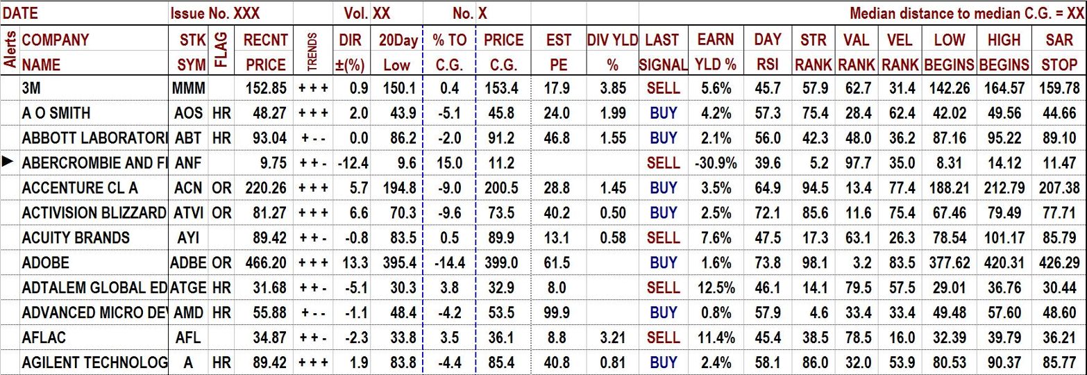
PERCENT TO “C.G.” or “Center of Gravity”: (Top right corner in the above image) This is the median distance of all stocks from the median “Price of Greatest Probability” (the focal point of price excursions above and below the 50-day moving average). We refer to the center about which all price swings converge as the “Center of Gravity” or “C.G.” A stock is much more likely to move to its C.G. than to any other price, including its current price (unless it is at its C.G.) A reading of 15% means that the typical stock in “The Valuator” must rise 15% to reach its “Center of Gravity.” A reading of -15% means that the typical stock must decline 15% to reach its point of equilibrium. A similar reading for an individual stock would mean there is a very high probability that the stock will begin to return to its C.G. very soon. We post the C.G. for each stock tracked as well as the median for all stocks covered. It should be pointed out that even if the reading in the top right corner is negative, there may still be a number of stocks that are rising and that have 6% or more potential gain before reaching the C.G. For example, on 7/3/2020, the top right corner of The Valuator indicated that the median distance of the recent price to the median C.G. was -2.19%. However there were at the same time, 24 stocks with potential gains ranging from 6% to 9.9%,10 stocks with potential gains ranging from 10.1% to 14.8%, and 8 stocks with potential gains ranging from 16.4% to 37.2%. On this date, there were 6 that had an alert signal in the left column. The others were not yet rising fast enough to warrant a “►” or a “♦” (see “►” AND “♦” ALERTS lower on this page). The Dow had dropped from its high more than 2700 points (about 10%) approximately 2 weeks earlier and stocks were still consolidating. There are almost always stocks with promising potential. If there are not, it is probably better to stay in cash anyway.
COMPANY NAME, “COMPANY INDUSTRY” & “STK SYM” These headings should all be self-evident.
FLAGs This column shows value indications and where a stock is in its cycle. “FLAG” defines eight positions in a stock’s cycle: 1. “HF” = High and falling, 2. “OF” = Overpriced and falling, 3. “UF” = Under-priced and falling, 4. “LF” = Low and falling, 5. “LR” = Low and rising, 6. “UR” = Under-priced and rising, 7. “OR” = Overpriced and rising, and 8. “HR” = High and rising. The chart below illustrates each part of the cycle indicated. If this column is blank, it is because the stock is in the region between underpriced and overpriced.

In the above graph, the curved and somewhat broken line represents a stock’s path as it swings above and below its “Center of Gravity.” We no longer worry about “Fair Value” as determined by analysts (it takes too long to find outr if the stock is going to get there, and it is also too “iffy,” because it depends so much on the analyst’s interpretation of whatever data has been given him, as well as the accuracy of his predictions about future earnings, and so on). Instead, we now calculate the stock’s price “Center of Gravity.” It is the price of central tendency about which the stock’s price fluctuates, somewhat like a moth’s orbiting of a light bulb. It is the price to which the stock is most likely to return in the short-term to intermediate-term.
TRENDS directions are indicated for each of 3 consecutive 20-day periods (“+-+” for Up, Down, Up respectively, for example). “DIR ±(%)” gives the rate of change in price for the stock for the last of the three 20-day periods noted by the “TRENDS” indicator.
“20-day Low” helps to identify stocks that are not performing well and indicates a possible stop-loss point. If a stock is performing well, it should make at least a little progress over a month’s time (approximately 21 market days). If it comes back to the 20-day low, it is not behaving well. Some subscribers may therefore opt to use the 20-day low in setting a stop loss (We subtract 30 cents from the actual 20-day low and post the result in this column. Many investors use the 20-day low for a stop-loss and some traders push the stock down through it in order to trigger those top-loss orders. The extra 30 cents provides an additional margin of safety).
“% TO C.G.” answers the question, “What would the gross profit be if I buy now and sell at the CG? It is thus an aid to locating stocks that are under-priced and that therefore have appreciation potential. Stocks that are over-priced have a negative figure in this column. Vertical blue dashed lines bracket this column for easy reference.
Price Center: if you take a wire or string and stretch it so that it is tightly drawn between two points, then pluck it, the string will vibrate up and down, repeatedly moving across an imaginary straight line connecting the end points of the string. When the string stops vibrating, it will be perfectly aligned with that imaginary line. The “Price Center” is the “Center of Gravity” (C.G.), “price of Greatest Probability,” or “target Price.” For our model, this is what we use for “Fair Value.” However, it is based on statistics, not on the ruminations of an analyst. It is based on the laws of probability and the actual just-taken measurements of the stock’s behavior.
“EST PE” (estimated PE): This is the current PE ratio.
“DIV % YLD” is simply the dividend expressed as a percentage of the stock’s price.
LAST SIGNAL: This column reports the last signal generated by Donchian’s dual moving average crossover system. If the 5-day moving average last crossed from above to below the 20-day moving average, the word “SELL” will be displayed. If the latest cross of the 5-day moving average was from below to above the 20-day moving average, the word “BUY” will be displayed. These are not recommendations. Rather, they are the signals generated by Donchian’s system. If the crossover occurred months ago, but there have not been any crossovers since, the latest signal will continue to be displayed.
EARNINGS YIELD: This is the earnings of the company per share divided by the price per share. It is the earnings you buy per dollar invested. It is actually the reciprocal of the PE ratio. the ratio is intended to be a convenience for those who like to compare stock investments with bond investments. It attempts to answer the question: what do you get for your investment. Of course, there is no guarantee you will actually get what you think you are buying when you buy shares in a company. Nevertheless, many consider this to be a worthwhile measurement when they factor in relative risk.
14-DAY RSI: The image above shows only “Day RSI” but the actual publication shows “14-day RSI.” This is the Relative Strength Index. It measures the proportion of momentum change over a the last 14 days caused by momentum on up days. RSI = 100-[100/(1+U/D)], where U = an average of upward price change and D = an average of downward price change. The RSI does not compare the relative strength of two stocks, but rather the internal strength of a single stock.
“STR RANK” (Strength Rank) measures recent stock strength and gives greater weighting to stocks that show more consistency in their recent performance. A proprietary algorithm is applied to at least 4 separate measurements to derive this figure, and then the combined scores are ranked relative to each other. Our own traders make extensive use of “Strength Rank” in developing their watch lists. We track the stocks located by The Valuator and monitor them for pull-backs. Even when investing in these stocks, investors should wait for a pullback (they should try to time their entry to coincide with when the stock has pulled back to its rising trend-line). Traders (and investors) should try to buy stocks early rather than late in the development of a strong positive trend in order to avoid stocks prone to “breaking down” shortly after their purchase. Usually, signs of weakness can be seen in a stock’s chart pattern (slowing momentum, greater volume on declines than on rallies, and so on). Some stocks highly ranked in this column may have simply gapped to a higher level because of speculation related to a possible takeover by another company. Such stocks may have limited upside potential. Whether or not this is the case for a particular stock can be determined by a visual inspection of its chart. We tend to avoid stocks that have suddenly started trading at a much higher price. This is a much more robust measurement than the popular RSI, but we post the RSI for those acquainted with it.
“VEL RANK” (Velocity Rank) is based on 3 consecutive 20-day periods. Stocks are ranked according to their performance in each of these periods and then these three ranking scores are totaled for each stock. The score totals are then ranked.
“►” AND “♦” ALERTS: If a stock can rise 10% or more before reaching its C.G., a “►” is displayed at the far left. If a stock can rise 6% or more, before reaching its C.G., a “♦” is displayed at the far left. However, a stock with an “♦” alert may continue rising after it reaches its C.G. and end up returning 20% or more, just as a stock with a “►” alert could end up returning 20% or more. That’s because stocks swing above and below their C.G. These indicators are not recommendations. They only highlight stocks that might warrant further attention. A stock that is flagged with “►” or “♦” may fall even further below the C.G. These alerts are given so you can focus you attention better. Monitor these stocks and wait for them to begin a definite uptrend before you consider them for purchase. You should be interested only in stocks that are low and rising, not in stocks that are low and falling. Even with low and rising stocks, there may be overhead resistance that would make a purchase inadvisable. Always look at a chart before making a decision. Look at the bottom half of the “Stock Alerts” page for examples of “setups.” Learn how to identify resistance. Read our tutorials.
LOW BEGINS: There is about a 15% probability that a stock will get below this level. The more below this level the stock falls, the more rare the event, and the greater the probability that the stock will reverse course and begin its advance toward its C.G.
High BEGINS: There is a 15% probability that a stock will get higher than this level. The more above this level the stock rises, the more rare the event, and the greater the probability that the stock will reverse course and begin its decline toward its C.G.
SAR STOP: The parabolic SAR indicator, created by J. Welles Wilder Jr., is used by traders to determine trend direction and potential reversals in price. It can be very effective when used with a trending stock. However, a stock moving sideways will tend to generate whipsawed signals, a series of buy/sell signals with little or no profit. A price drop below the SAR of a rising stock is a sell signal. A price move above the SAR of a declining stock is a buy signal.
POTENTIAL RETURN ON INVESTMENT CHART: A column rising above the zero line shows potential profit. A column that falls below the zero line shows potential loss. The first column in the chart is the yield of the 10-year Treasury. The middle column is the median of the “Earnings Yield” of all the stocks tracked. Investors often compare the Earnings Yield of stocks to the yield of the 10-year bond to decide whether to invest in equities vs. bonds. They divide the bond yield by the earnings yield. If the ratio is above 1.0 the stock or stock benchmark is said to be overvalued; a reading of less than 1.0 indicates the stock or stock benchmark is undervalued. The theory behind the ratio is that if stocks are yielding more than bonds, then stocks are cheap because more value is being obtainable by investing in equities. Example: If the bond yield is .9% and the earnings yield (middle column in chart) is 4.5%, the ratio is 0.2 (equities are cheap).
The third column is the amount stocks must rise or fall to reach the median “C.G.” If this column extends below the zero line, it means the median price of the stocks tracked is above the median center point (“Center of Gravity”) about which stocks swing up and down. Since the “Center of Gravity” is determined by the behavior of each stock over a two-year period, the model for each stock is unique and factors in the nature of the business of the company, whether it manufactures buggy whips, computer chips, or pharmaceuticals, and also how the market values each dollar of earnings for that company. The current price of each stock is viewed in reference to each stock’s own statistical model. For example, if the column for the price of greatest probability or “C.G.” (third column in the above chart) shows a reading of 10% (it is above thee zero line), it means that the stocks tracked in The Valuator, taken as a group, are 10% below their “Center of Gravity,” and that potential profit is 10%. This reading is always based on statistical probabilities, and those are updated for each issue. It should be pointed out that even if current price is above the median C.G. (and the typical price must fall to reach the typical C.G.), there may still be a number of stocks that are rising and that have 6% or more potential gain before reaching the C.G. For example, on 7/10/2020, the top right corner of The Valuator indicated that the median distance of the recent price to the median C.G. was -1.70%. However there were at the same time, 37 stocks with potential gains ranging from 6% to 9.9% and 29 stocks with potential gains ranging from 10.1% to 49.3%. Of those stocks, all were giving alerts, indicating the stocks had potential and should be reviewed, and if acceptable, watched for timely entry points.
20-DAY MOVING AVERAGE SUMMARY CHART FOR ALL STOCKS: This chart shows the 20-day moving average over each 20-day period for the last 60 days. It always starts at 100 for easy determination of percentage gain or loss.
BLANK SPACES: Blank spaces usually means data was not available, as when a stock is added that does not yet have sufficient historical data for our algorithms to calculate meaningful results. This is usually a temporary condition that will automatically self-correct in time.
STATISTICS
The Valuator also includes a table with information similar to the following.

EXPLANATION OF THE ABOVE STATISTICS TABLE: Using the a mathematical procedure to map the probability envelope about the “Center of Gravity” and calculate the probable low and high prices (approximately 15% of the time, prices will go higher, and about 15% of the time the low will go lower) for the C.G. path of each stock. Then we compute averages for all stocks (see “Estimated Average Lo” & “Estimated Average Hi” ). “Advancing Issues” gives the number of stocks with a rising 20-day average price (stocks with a ▲ 20-day average). “Declining Issues” (stocks with a ▼ 20-day moving average) gives the number of stocks with a declining 20-day average price. Note the last 3 items just above “Who is Dominating?” The most recent 20-day rate-of-change (ROC) in the 20-day average price of each stock is computed. The same ROC figures are computed as of 20 days ago and 40 days ago. The average of each of these measurements is posted. If the average 20-day moving average was declining 40 days ago but is rising now, the market may be turning from a down market to an up market, especially if it was also rising 20 days ago. Together, this data can be used as a tool for analyzing general market behavior over the last 60 trading days (about 3 calendar months).
~~~~~~~~~~~~~~~~~~~~~~
Develop A Trading or Investment Discipline.
The Valuator contains both fundamental and technical information. This market “newsletter” uses statistics and probability analysis to determine the price “Center of Gravity.” The models used to determine C.G. are based on data that is unique for each stock. The Valuator ranks stocks using various screens (% to CG, PE, yield, strength). It is a tool that facilitates disciplined investing. It helps limit risk by showing how much a stock is “underpriced” or “overpriced” relative to its probability model. It shows the 20-day low (used by some to set a stop-loss), helps you allocate assets to lower portfolio risk when the market is risky. When used correctly, it could help you protect your assets in a market crash. It also alerts (“Flag” column) as to where a stock is in its cycle as it oscillates between being “underpriced” and “overpriced.” In addition, it flags “underpriced” stocks (“►” or “♦” placed to the left of the name). The Valuator is a tool that we use ourselves. Since we had to produce the publication for our own trading and investing activities anyway, we decided that we might as well make it available to others by subscription. We designed it to meet the needs of a systematic or disciplined approach to investing or trading. If you have a spreadsheet, data can be sorted and ranked. For example, you could create a discipline in which you select stocks only if they have to appreciate at least 10% to reach their C.G., that are not only low but also rising faster than half of all rising stocks. You could add other parameters to your strategy, like a PE ratio of so much and a certain percentage dividend yield. You could incorporate a “Strength” listing (The Valuator sorts stocks by their strength scores and lists the top 38 in rank order. You could make a longer list by doing the sorting yourself. You could also require a “setup” chart configuration and a “trigger event” before buying. See the bottom of the “Stock Alerts” page for information on some “setups.”
Analysts tend to base their reports on the past year (outdated) or make estimates for the next year (they are notoriously wrong). For over 30 years, our valuation models were based on financial data for the last 6 months combined with analyst estimates for the next 6 months (they are more accurate when looking ahead only 6 months). However, we have decided to make a significant change. We wanted more accurate, more timely, and more reliable data and price targets.
For more information on why we changed from “Fair Value” valuations based on earnings and other fundamental information to “valuations” based on statistics and the mathematics of probability click on Center of Gravity
Compare With The Typical Market Letter
The Valuator costs much less than the price of a subscription to the average stock market newsletter even though it provides much more. The average market letter has 8 to 12 pages. As of the June issue for 2020, we printed a hard copy of The Valuator, and it consisted of 24 pages. The data provided by the typical 8 to 12-page letter is rather limited and covers only a few stocks. The data that is provided cannot be sorted, sifted, or manipulated by the subscriber. We know of no other market letter that provides as much information (with regular follow-up) at anywhere near the price of The Valuator. However, we suppose there are many market letters of about half the size (with a lot less information) that are available at about twice the price.
The Valuator is created in Excel 2003. If we used a newer version of Excel, then subscribers with older versions would have a problem accessing the data. New versions can open files based on Excel 2003. You must be able to open an Excel spreadsheet on your computer to be able to download the spreadsheets.
See List of Stocks Tracked By The Valuator
To cut down on expenses, our policy is not to store printed copies for distribution to those who lose their copies, or to provide free samples. Also, we have no electronic archive of past issues. We urge people who want hard copies for future reference, to make copies of their own.
For a brief summary of the main features and an opportunity to place a subscription order for the online version, see The Valuator on our “Products and Prices” page. The link “More info >>” at the bottom of the page will bring you back to this page.