Stock Disciplines Signals Scanners & Stops
Stock Market Review

1. A free daily list of high-momentum stocks is at Momentum List 2. A free daily list of stocks with high Relative Strength is at high-rsi-stocks 3. A free list of stocks having a surge in volume is at Volume Surges4. A free list of what we call “Hot Stocks” is at Hot Stocks 6. Free interactive stock charting is at Charts This site also has breakouts, stocks in setup patterns, strongest ETFs, stock alerts, stock scanners, and ETF signals and numerous indicators.
We use “setups” (pre-surge patterns) to maximize our profit potential with our scanner reports
Please Read
Dow Jones Average (2 Days, 5-Minute Intervals)
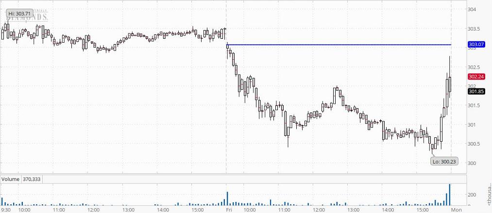
If the chart is the DIA, it will show volume. The horizontal blue line is at
the opening level of the day. A small line marks the midpoint of each period.
Why The Dow is Important For Indicators and Analysis (See 14)
Daily Chart of The Dow Jones Industrial Average
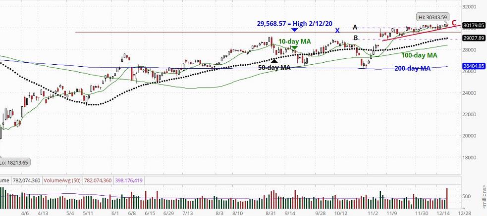
The volume’s 50-day moving average crosses the volume bars
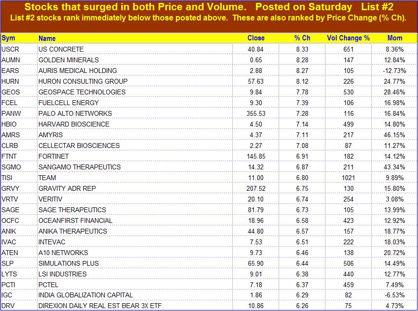
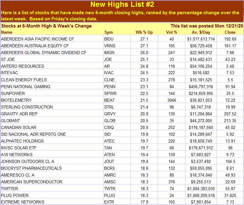
On weekends (usually on Sunday), we also post a list of new highs.

Early Notes: Monday
The stock markets in Europe and current U.S. stock futures data.
FTSE 100 (England) lost -147.53 (-2.26%) Last 6381.65 Time 7:29:47am ET,
DAX (Germany) lost -399.97 (-2.93%) Last 13230.54 Time 7:29:45am ET,
Swiss Market Index (Switzerland) lost -184.70 (-1.76%) Last 10339.16 Time 7:29:47am ET.
U.S. Stock futures as of Monday, 4:47 am (within 10 seconds) Pacific (7:47 am ET): S&P is down 63.5 points or 1.71%, the Nasdaq is down 130 points or 1.02%, the Dow is down 442 points or 1.47%, and the E-mini Russell 2000 is down 58.4 points or 2.97%.
Futures still down by more than 1% before the market opens.
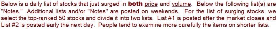
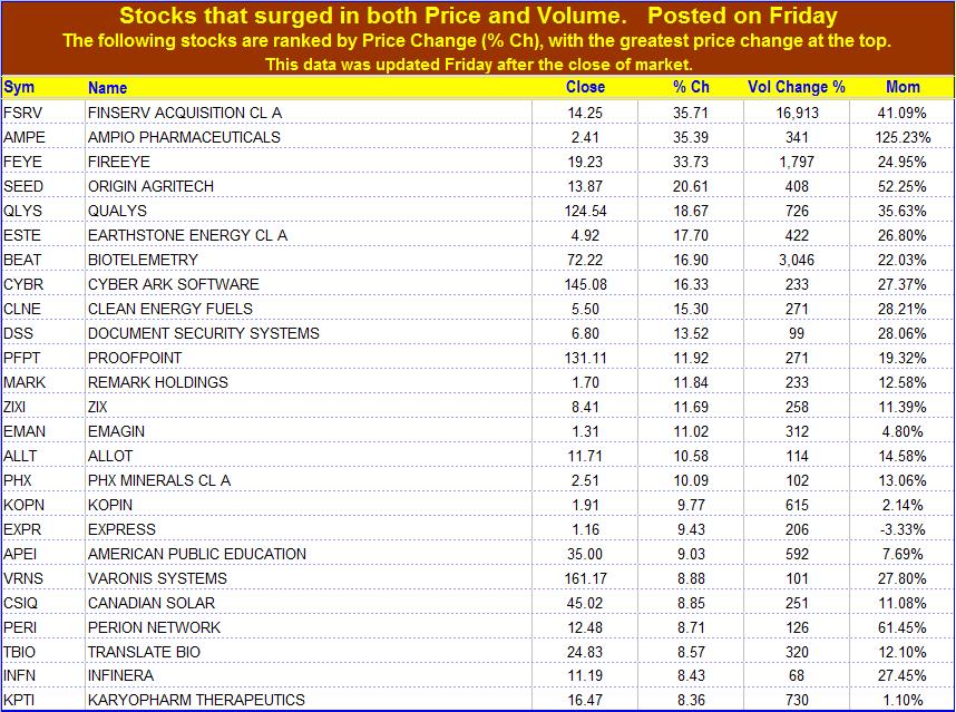
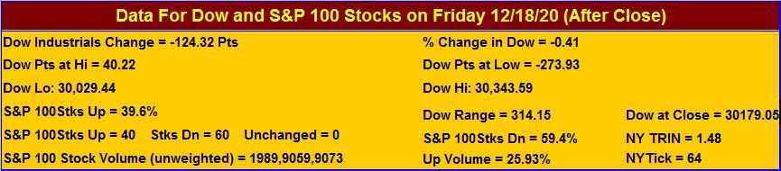
Friday, 12/18/20 (After Close):
The Dow closed at 30,179.05 for a loss of 124.32 points or 0.41%, the S&P 500 closed at 3,709.41 for a loss of 13.07 points or 0.35%, the Nasdaq closed at 12,755.64 for a loss of 9.11 points or 0.07%, and the E-mini Russell 2000 closed at 1,969.99 for a loss of 8.06 points or 0.41%.
Note that today we posted the interval chart of the Diamonds (DIA) rather than that of the DJIA. The reason was to show you the volume pattern. Note that while the Dow was weak most of the day, volume picked up and the benchmark began a vigorous rise in the last thirty minutes of trade. Quadruple witching had a lot to do with the surge in volume. The Daily chart shows that the Dow declined until it approached the red line “C” and the dashed line “A.” At that level, the support was sufficient to stop the decline. The interval chart shows that the Dow reached that level at about 11:15 and then bounced. It tested support there again at 15:25 and surged after that. You can see the effect of mutual fund and ETF repositioning. Note the last volume bar on the daily chart. It is far greater than the 50-day volume average. That amount of volume would normally result in a significant change in the benchmark. However, today it did not cause a significant move. The Dow moved less than 1/2 of 1%. There was a great deal of churning but it was not primarily directional. The Dow is still moving along and above line “C,” a line that marks gradually rising support. To get a sense of how the market is likely to close on Monday, monitor the benchmarks during the first hour relative to the Key Intraday Levels posted below. Also, look for early indications of the probable open suggested by pre-market data that we post in our “Early Notes.” Check the “Earnings Due” page for a list of companies about to report earnings. Maintain stop losses at levels you can tolerate if they are triggered. ~ Our site is focused on “setups,” chart configurations that are most often seen before a price surge. Be sure to wait for the “trigger event.” A “trigger event” is your buy signal, assuming there is not overhead resistance or other contrary indications. For more on setups, go the Q&A page and read item 13. Then use the link at the end of that explanation.
All three of the major stock benchmarks closed a little lower on Friday, weighted down by the continuing uncertainty surrounding a coronavirus stimulus deal. The U.S. Congress looks increasingly unlikely on Friday to meet a deadline to agree on $900 billion in fresh COVID-19 aid and instead may pass a third stopgap spending bill to keep the government from shutting down at midnight. Recent weak economic data is pressuring lawmakers to reach a deal. All three major indexes hit record highs at the opening before they retreated. The S&P 500 technology index was the biggest drag on that benchmark. Trading volume has increased due to the expiration of stock index futures, stock index options, stock options and single stock futures at the end of trade, known as “quadruple witching.” Investors keep hoping an agreement can be reached, while their angst is increasing because of the rising number of COVID cases and because economic data is beginning to deteriorate. The expectation of continued monetary and fiscal stimulus has helped investors look past the economic impact of the pandemic, and given rise to expectations of strong annual gains, despite a rocky start for the year. ~ Tesla, which on Monday will become the most valuable company ever to be added to Wall Street’s main benchmark index, traded on heavy volume. Tesla shares soared to an all-time high in anticipation of their addition to the S&P 500 next week. The stock gains were driven by the buying by various ETFs and mutual funds positioning ahead of the Index change to get us close to the price as possible for tracking error purposes..
On the New York Stock Exchange proper (not the Composite), there were 1,334 advancing issues, 1,811 declining issues, and 98 unchanged issues. Total volume (in 1000s) on the NYSE was 3,108,899 shares. Declining issues outnumbered advancing issues by a ratio of 1.36 to 1. For advancing issues, the total volume was 1,023,600 shares, and for declining issues, the total volume was 2,062,184 shares. Declining volume exceeded advancing volume by a ratio of 2.01 to 1. Today there were 269 new 1-year highs and 4 new 1-year lows. The average Total Volume for the NYSE over the last 50 days (in 1,000s) was 1,004,404 shares. Today’s volume was 209.53% greater than the average Total Volume for the NYSE over the last 50 days.
The following stocks were among the biggest gainers (the change in volume indicated for each is relative to the previous day’s volume): Fortinet (FTNT.O) gained 9.43 points or 6.9% with a volume increase of 182.23%. Vulcan Materials (VMC) gained 5.68 points or 4.1% with a volume increase of 170.55%. Abiomed (ABMD.O) gained 11.40 points or 4.0% with a volume increase of 232.33%. Martin Marietta Materials (MLM) gained 10.62 points or 4.0% with a volume increase of 146.56%. Cadence Design Systems (CDNS.O) gained 4.72 points or 3.7% with a volume increase of 128.75%. Dow (DOW) gained 1.83 points or 3.4% with a volume increase of 415.46%. Ansys (ANSS.O) gained 11.18 points or 3.2% with a volume increase of 155.95%. Take Two Interactive Software (TTWO.O) gained 5.99 points or 3.0% with a volume increase of 142.48%. Dupont De Nemours (DD) gained 1.84 points or 2.6% with a volume increase of 318.31%. Autodesk (ADSK.O) gained 7.65 points or 2.6% with a volume increase of 149.04%.

Additional Dow Data
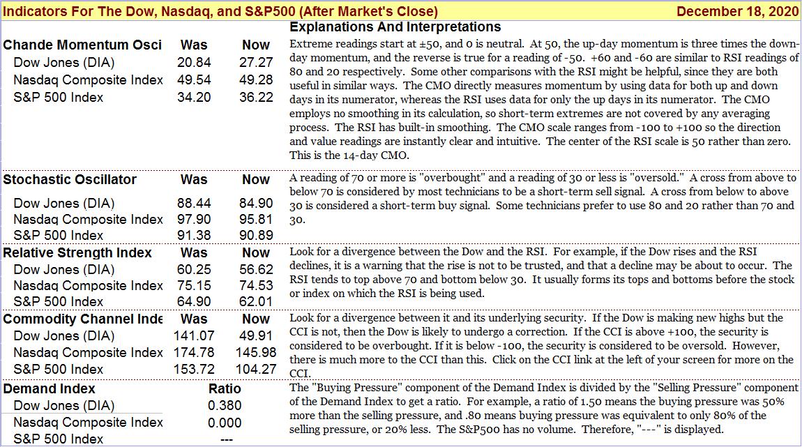
The Dow (DJIA) closed at 30,179.05. The Dow Diamonds closed at301.90. Unlike the DJIA, Dow Diamonds data includes volume. The change in price was -0.52%. Relative to the previous close, the change in volume for the Dow Diamonds was +40.33%. Volume was 18.61% greater than the 50-day moving average of the volume. This figure depends on when, after the close, the volume is measured. The 20-day Chande Momentum Oscillator (CMO) went from 25.79 to 18.84. An extreme value for this metric is ±50 (+50 would indicate an overbought condition and -50 would indicate an oversold condition). The stochastic oscillator went from 88.44 to 84.90. Technicians consider readings of 80 or more to be indicative of an overbought condition and readings of 20 or less to be indicative of an oversold condition. The 14-day CCI went from 141.07 to 49.91. Probabilities call for an early morning advance tomorrow, barring negative news events. For information on PAL’s probability estimates, click on the blue “PAL” link.
The Key Bullish Intraday Level to watch is 302.31. The Key Bearish Intraday Level to monitor is 301.00. If the Dow is above the Key Bullish Level (or below the Key Bearish Level) for more than 30 minutes of the first hour of trading, it will have an 80% probability of closing higher (or lower) for the day. These probabilities assume there are no news events that modify investor sentiment between now and the next market close.
PAL CCI readings and what they mean
See Discussion of “Key Intraday Levels” & Pivot Levels
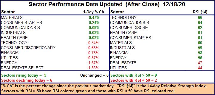
“Sector Performance” is located below “S&P 500 Data”
S&P500 Index and Nasdaq Composite Index
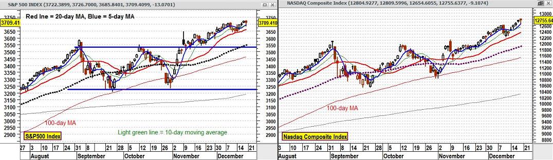
Blue line (5-day) crossing above red line (20-day) = “Buy” Blue crossing below red line = “Sell”
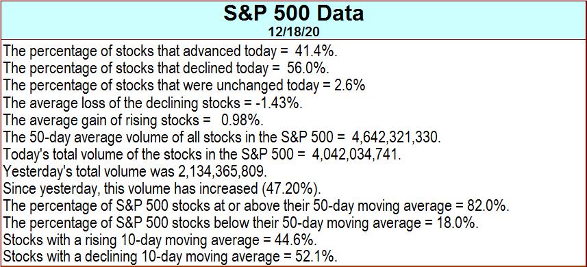
S&P 500 Data
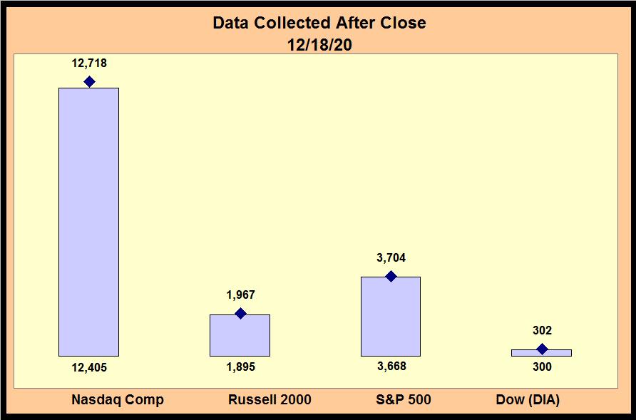
The S&P 500 closed at 3,709.41. This was a change of -0.35%. In the chart of the S&P 500 above, the 5-day moving average closed at 3,704. The 10-day moving average closed at 3,688. The 20-day moving average closed at 3,668. The 50-day moving average closed at 3,553. The 20-day Chande Momentum Oscillator (CMO) went from 41.06 to 33.95. An extreme value for this metric is ±50 (+50 would indicate an overbought condition and -50 would indicate an oversold condition). The stochastic oscillator went from 91.38 to 90.89. Technicians consider readings of 80 or more to be indicative of an overbought condition and readings of 20 or less to be indicative of an oversold condition. The 14-day CCI went from 153.72 to 104.27.
The Key Bullish Intraday Level to watch is 3,714. If the S&P500 Index can stay above that level for more than 30 minutes of the first hour of trading, it will have an 80% probability of closing higher for the day. The key bearish intraday level to watch is 3,704. If the S&P500 Index stays below that level for more than 30 minutes of the first hour of trading, it will have an 80% probability of closing lower for the day. These probabilities assume there are no news events that modify investor sentiment between now and the next market close.
Additional Nasdaq Data
The Nasdaq Composite Index closed at 12,755.64. This was a change of -0.07%. Relative to the previous close, the change in volume for the Nasdaq Composite was -100.00%. Volume was -100.00% less than the 50-day moving average of the volume. The 20-day Chande Momentum Oscillator (CMO) went from 59.02 to 55.33. An extreme value for this metric is ±50 (+50 would indicate an overbought condition and -50 would indicate an oversold condition). The stochastic oscillator went from 97.90 to 95.81. Technicians consider readings of 80 or more to be indicative of an overbought condition and readings of 20 or less to be indicative of an oversold condition. The 14-day CCI went from 174.78 to 145.98. In the above Nasdaq chart, the 5-day moving average closed at 12,718. The 10-day moving average closed at 12,573. The 20-day moving average closed at 12,405. The 50-day moving average closed at 11,922.
The Key Bullish Intraday Level to watch is 12,776. If the Nasdaq Composite Index can stay above that level for more than 30 minutes of the first hour of trading, it will have an 80% probability of closing higher for the day. The key bearish intraday level to watch is 12,735. If the Nasdaq Composite stays below that level for more than 30 minutes of the first hour of trading, it will have an 80% probability of closing lower for the day. These probabilities assume there are no news events that modify investor sentiment between now and next market close.
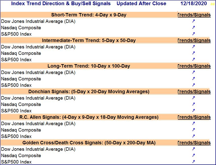
Buy/Sell Indicator
Diamond Above Column = Bullish Diamond Inside Column = Bearish
The above indicator is based on Donchian’s 5-day x 20-day dual moving average crossover system. When the 5-day moving average crosses below the 20-day moving average, a “sell” signal is generated. When the 5-day moving average crosses above the 20-day moving average, a “buy” signal is generated. In the chart, the black diamond represents the 5-day moving average. The column represents the 20-day moving average. Sometimes, with a stock chart, it is difficult to determine at a glance whether or not the 5-day moving average has actually crossed over to the other side. This graphic is intended to make it easy to determine at a glance whether a crossover has occurred for each of the four benchmarks. Reviewing this chart should be much faster and far more convenient than looking at a chart of each benchmark with the two moving averages plotted. To make it even easier, the closing price of each moving average is indicated (decimals omitted). The closing price of the 5-day moving average is posted above the diamond. For the 20-day moving average, the closing price is at the base of the column. The Donchian is one of the best dual moving average systems. We have verified this with our own tests. To see the test results, go to https://stagging.stockdisciplines.com/best-sell-strategy
Also, use the link provided near the bottom of that page to read the follow-up comments, and use the link provided in the follow-up report to read the results of the Merrill Lynch study on using various systems in commodities trading and also the comparison of exponential moving averages vs. simple moving averages.
The Latest Impulse Readings For The Dow Jones Industrial Average
(What is likely to happen next?)
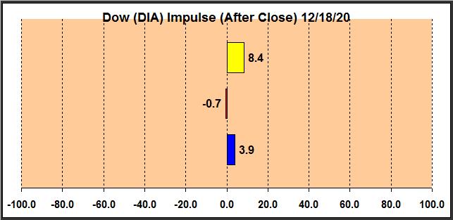
Explanation

Support and Resistance

Group Pressure Gradient Comparisons
See Explanations Of Various Readings
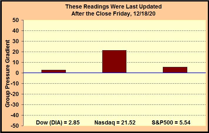
Group Pressure Gradient
The market has an effect on shares analogous to the effect of air currents on an airplane. The greater the speed of the wind, the more difficult it is for a plane heading into the wind to make headway. However, a plane moving in the direction of the wind will find it much easier it to make headway and to gain speed. An airplane has its own driving force, but the plane’s environment exerts its external force on the plane. Likewise, shares have their own motion based on supply/demand considerations pertaining to those shares, but the environment in which the shares exist exerts forces on the shares that are unrelated to the merits of specific shares within that environment. We refer to this “force” as the Group Pressure Gradient, and we sometimes refer to it as the “Force of Trend.” A Group Pressure Gradient (or Force of Trend) reading near zero might be compared to flying on a windless or near windless day, and a reading of 28 might be compared to flying with a gentle to moderate tail wind. To continue the analogy, a reading of 28 to 57 might be compared to flying with a moderate to strong tail wind, while a reading of 57 to 85 would be like flying with strong winds to gale level tail winds. Negative readings would reverse the above comparisons. Of course the analogy is not perfect because a pilot would not want to fly in gale winds, but we certainly would not mind investing in shares when the market is registering 57 to100 on the pressure gradient scale. The scale ranges from -100 to +100. The Group Pressure Gradient has both magnitude and direction. Hence, it is a vector.
A river or stream has many currents, cross-currents, counter-currents, eddies, and minor whirlpools. If a person wants to know what the pressure gradients are in a stream, he must select a specific spot in the stream to conduct his measurements. The same thing applies to pressure gradients in the stock market. To measure a pressure gradient, it is necessary to select a specific group of stocks within the market. We are currently calculating this indicator for three groups of stocks: large-cap blue-chips, stocks listed on the Nasdaq, and stocks that make up the S&P500 index (the last time we checked, the S&P500 consisted of 50.8% mid-cap, 45.4% large-cap, and the rest were small-cap). Measurements are not made for individual stocks in isolation. It is the general environment of the stocks in these groups that is being measured. Please be aware that some big-cap blue-chip stocks are in the Dow, in the S&P500, and on the Nasdaq. Each grouping has its own group pressure gradient. Therefore, in such cases, it is best consider each environment but give the strongest weighting to that of the Dow (because the Dow has the greatest relative concentration of investors in blue-chips who also represent the biggest relative concentration of big money). If you are not investing in blue-chips, then you might give more weighting to the S&P 500. If you are investing in a portfolio of technology stocks, then give emphasis to the reading for the Nasdaq. Usually the groups have similar readings, but sometimes they are quite different. It is also important to understand that an index (like the S&P500) may rise on a given day while the pressure gradient of the group of stocks that define the index is still negative. Individual stocks within a group can surge (because of a news event, for example), even when there is a negative pressure gradient.
The indicator is extremely sensitive and can change dramatically from day to day. It might be best to think of it as measuring the current status of the pressure gradient. Earlier, we gave the analogy of an airplane flying with or against the wind. Bear in mind that air currents are constantly shifting in direction and intensity. An airplane often encounters gusts of wind. Similarly, this indicator will occasionally have “gusts” and reversals. In other words, the indicator can sometimes be volatile on a daily basis. After observing it for a few days, a general pattern may emerge. It may become evident that the indicator tends to show pressures more often in one direction than in the opposite direction. The pressure gradients can become progressively stronger or weaker. This can be very helpful information for short-term to intermediate-term investors. The current reading can also be very helpful in the timing of entry points. While pivot points tend to have relevance only for a single day, this indicator’s measurements can have relevance for many days, depending on market conditions. While it is possible to smooth the readings (make them less volatile), doing so would reduce sensitivity. This indicator is new (first introduced on 6/3/15). After people have had some experience using it awhile, if the majority would prefer less sensitivity, we can modify it to accomplish that. We wanted to make the indicator sensitive initially because we tend to prefer it that way. Computational details are proprietary.
Pivot Points
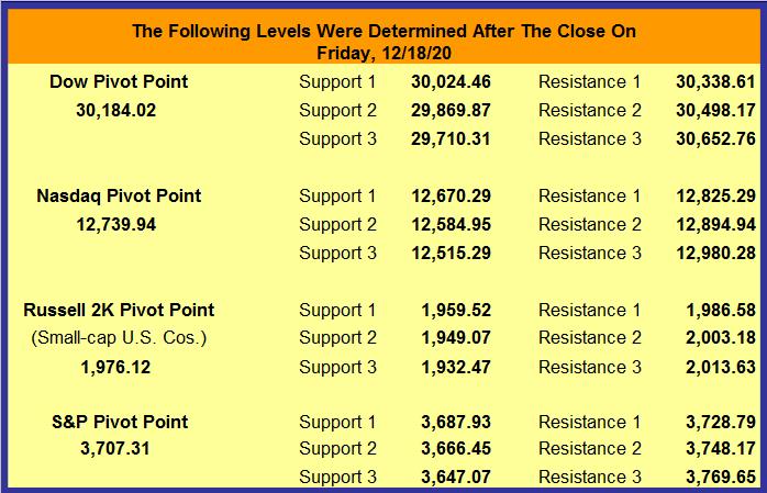
Explanation
A pivot point is a price level that is used by traders as a predictive indicator of market movement. A pivot point and the associated support and resistance levels are often turning points for the direction of price movement in a market. Prices tend to swing between two levels. For example, if a price is right at the first level of support (“Support 1”), the probability is that it will move back toward the “pivot point” These levels are very weak, and have most relevance for intraday action. In an up-trending market, the resistance levels may represent a ceiling level in price above which the uptrend is no longer sustainable and a reversal may occur. In a declining market, the support levels may represent a low price level of stability or a resistance to further decline. Pivot points were originally used by floor traders in setting key levels. Before the market opened, floor traders would calculate the pivot points for the day. With these pivot points as the base, additional calculations were used to set support 1, support 2, resistance 1 and resistance 2. These levels could then be used as trading aids throughout the day. The resistance levels are where sellers are likely to enter the market, depressing prices. Therefore, it is significant if a stock can push its way through the selling pressure. It takes buying demand to push shares higher through levels at which sellers are waiting. Likewise, the support levels are where buyers are likely to enter the market, exerting upside pressure on prices. Therefore, it is significant if a stock declines through the buying pressure. It takes significant share selling for shares to continue dropping, even through levels at which buyers are waiting. The price of a security or Index will remain between pivot support 3 (S3) and pivot resistance 3 (R3) 80% – 85% of the time. Therefore, many traders will wait for a move toward either R3 or S3 to show signs of stalling. When the stalling is evident, they will buy a stock that has been declining toward S3 or sell a stock that has been rising toward R3. In the above discussions of the Dow, S&P 500, and Nasdaq Composite Index, see “4-Stage Indicator and Signals” for R3 and S3.
Trading Result For One Of Our Traders
Long ago we proved to our own satisfaction (by trading with real money) that to obtain gains of more than 50% a year it is not necessary to invest in options, currencies, or commodities. It can be done simply by buying and selling stock. All you need is a good discipline (and that you actually follow your discipline). That is what this site is all about. We do not make a practice of revealing the performance of company traders. There is little reason to do so, and it is nobody’s business but our own. However, one of our traders has given permission for us to share her performance on a one-time basis.
After brokerage fees, her net return for the year was 58%. The same year, the Dow gained 18.8% and the S&P 500 gained 23.45%. All she did to obtain this return was to buy and sell stocks. She simply cut losses quickly, focused on good setups, and looked for trigger events. When it was time to sell, she did not talk herself out of it or “argue” with the evidence. She also did not sit “glued” in front of her computer. She entered her trades and set her stop losses. Often, the only time she could check her positions was long after the market closed. She did not have to agonize about margined positions held overnight because they were not part of her discipline.
It might also be worth mentioning that to optimize liquidity, to minimize the spread between bid and ask, and for risk-control reasons, this trader prefers to avoid stocks that trade for less than $5. Most of the stocks she trades are followed in The Valuator. This trader is a very private person who does not want to report her returns every year, even if her name is not disclosed, so there is no plan to update this performance in future years. This report was posted shortly after the data was available, and it will be left here for future visitors.
Please be aware that she did have major distractions during this year that almost certainly got in the way of her achieving a significantly greater return (there were three traumas that year including a divorce). In other words, this was by no means the best she could do. However, she allowed us to reveal her performance anyway in order to encourage others and to show that returns above 50% are achievable (even under less than ideal conditions).
The discipline used was extremely low in risk, much lower than the risk assumed by the average mutual fund investor or the buy-and-hold investor in individual stocks. Yes, she could have achieved a much higher return if she had kept her positions highly leveraged. She does not wish to take that route. Greed destroys discipline. 80% of the people who fully leverage their investments in the futures markets eventually lose all their money. The same can be said for some who trade penny stocks and currencies. It is not the use of leverage that makes a winner, but the use of a good discipline. Too many people don’t get that fact.
The discipline used to achieve the above return is our own creation. We do not make it available to the public as part of any service or training program. In other words, we are not providing this performance information to solicit your enrollment in any kind of program. It is provided only to encourage people to be diligent in the development of their own discipline. We will leave this report here to encourage others who may be wondering if working at developing a discipline is worth the effort.
The Buy and Sell Signals of 6 Systems
These systems cover different investment time-horizons. Each system uses two moving averages, with the exception of the R.C. Allen system, which uses three averages. If the short moving average (MA) is above the long MA, the configuration is considered to be “Bullish” because the current momentum has taken a more positive aspect relative to the longer MA. A bullish pattern is indicated by an up arrow ↗. If the short MA is below the long MA, the configuration is “Bearish” in its implications. A bearish pattern is indicated by a down arrow ↘. Thus, the direction of the arrow indicates the direction of the last crossover event. When a signal is generated, the word “Buy” or “Sell” will appear. These signs are not recommendations. They merely indicate the crossover event (the short MA has just crossed the longer MA), indicating a change from a bullish to bearish outlook or from a bearish to bullish outlook. When the signal is generated, there will be a “◄” at the right of the word “Buy” or “Sell” to draw your attention to the event. The red arrow will display for only the day on which it is generated. The following day the arrow will be gone when the table is updated, and the up arrow or down arrow will replace the word “Buy” or “Sell.” The down arrows are shifted to the right to make it easier to spot the difference at a glance. The table should be of interest to short-term, intermediate-term, and long-term investors. For example, when the outlook for the S&P 500, Dow, or the Nasdaq Composite Index is “Bullish,” the general trend of the Index is supporting bullish positions in those and stocks similar to those in the indexes. Also, some people may use the signals of one of the following systems to time entries and exits for their Index-tracking ETFs. That is, these signals may be of use in timing when to be in and when to be out of the market, based on the preferred system or investment time-horizon.
S&P 100 and Dow Stocks
The S&P 100 is a subset of the S&P 500. It includes 100 companies that have exchange-listed options. The stocks that make up the S&P 100 represent more than 50% of the market capitalization of the U.S. equity markets (as of January 2017). All stocks on the following list are in the Dow and/or the S& P 100 (At this writing, there is only one stock in the Dow that is not in the S&P 100). The approximately 100 stocks listed (mergers may change the count) are ranked in the order of their percentage gain for the day. A review of the list might suggest where the pockets of strength are in the market.
| Data For S&P 100 and Dow Stocks | Updated Fri p.m. After Close 12/18 | |||
| Symbol | Description | Last | Change | % Change |
| DOW | DOW INC | 55.66 | 1.83 | 3.40% |
| DD | DUPONT DE NEMOURS INC | 71.33 | 1.84 | 2.65% |
| ORCL | ORACLE CORP | 65.06 | 1.45 | 2.28% |
| MO | ALTRIA GROUP INC | 43.78 | 0.78 | 1.81% |
| ADBE | ADOBE INC | 502.95 | 7.59 | 1.53% |
| CSCO | CISCO SYSTEMS INC | 45.44 | 0.62 | 1.38% |
| MDT | MEDTRONIC PLC | 116.71 | 1.37 | 1.19% |
| MA | MASTERCARD INCORPORATED COM | 340.33 | 3.43 | 1.02% |
| CAT | CATERPILLAR INC | 180.96 | 1.79 | 1.00% |
| LMT | LOCKHEED MARTIN CORP | 356.03 | 3.43 | 0.97% |
| BK | BANK OF NEW YORK MELLON C | 40.79 | 0.38 | 0.94% |
| BMY | BRISTOL-MYERS SQUIBB CO | 63.12 | 0.58 | 0.93% |
| KO | COCA-COLA CO | 53.74 | 0.47 | 0.88% |
| TXN | TEXAS INSTRUMENTS INC | 164.07 | 1.38 | 0.85% |
| PEP | PEPSICO INC | 146.93 | 1.22 | 0.84% |
| ALL | ALLSTATE | 107.40 | 0.84 | 0.79% |
| VZ | VERIZON COMMUNICATIONS | 60.46 | 0.45 | 0.75% |
| DHR | DANAHER CORP | 226.11 | 1.62 | 0.72% |
| GD | GENERAL DYNAMICS CORP | 152.67 | 1.08 | 0.71% |
| FB | FACEBOOK INC COM | 276.40 | 1.92 | 0.70% |
| UNP | UNION PACIFIC | 203.60 | 1.40 | 0.69% |
| ACN | ACCENTURE PLC | 266.25 | 1.78 | 0.67% |
| CRM | SALESFORCE.COM | 227.43 | 1.51 | 0.67% |
| MDLZ | MONDELEZ INTL INC COM | 58.32 | 0.39 | 0.67% |
| TRV | TRAVELERS COMPANIES INC | 138.86 | 0.83 | 0.60% |
| JNJ | JOHNSON & JOHNSON | 154.51 | 0.89 | 0.58% |
| PG | PROCTER & GAMBLE CO | 139.04 | 0.79 | 0.57% |
| PM | PHILIP MORRIS INTL INC | 86.09 | 0.42 | 0.49% |
| KHC | KRAFT HEINZ CO | 34.77 | 0.15 | 0.43% |
| PYPL | PAYPAL HOLDINGS INC | 236.45 | 0.94 | 0.40% |
| UPS | UNITED PARCEL SERVICE INC COM | 175.18 | 0.69 | 0.40% |
| MCD | MCDONALD’S CORPORA | 215.08 | 0.83 | 0.39% |
| TMO | THERMO FISHER SCIENTIFIC INC | 466.68 | 1.74 | 0.37% |
| CL | COLGATE-PALMOLIVE CO | 85.93 | 0.27 | 0.32% |
| NFLX | NETFLIX | 534.45 | 1.55 | 0.29% |
| IBM | INTERNATIONAL BUS MACH CORP | 125.85 | 0.30 | 0.24% |
| ABT | ABBOTT LABORATORIES | 108.97 | 0.19 | 0.17% |
| SBUX | STARBUCKS CORP | 103.28 | 0.07 | 0.07% |
| V | VISA INC COM | 211.31 | 0.13 | 0.06% |
| GILD | GILEAD SCIENCES INC | 59.08 | 0.01 | 0.02% |
| CVS | CVS HEALTH CORPORATION | 69.55 | -0.04 | -0.06% |
| WMT | WALMART INC | 145.95 | -0.15 | -0.10% |
| MMM | 3M COMPANY | 176.42 | -0.23 | -0.13% |
| EXC | EXELON CORP | 42.57 | -0.08 | -0.19% |
| LOW | LOWE’S COMPANIES INC | 163.20 | -0.34 | -0.21% |
| BIIB | BIOGEN INC | 249.62 | -0.62 | -0.25% |
| CHTR | CHARTER COMMUNICATIONS INC COM | 652.00 | -1.98 | -0.30% |
| EMR | EMERSON ELECTRIC CO | 80.90 | -0.26 | -0.32% |
| MRK | MERCK & CO INC | 79.53 | -0.29 | -0.36% |
| DIS | WALT DISNEY COMPANY (THE) | 172.89 | -0.66 | -0.38% |
| MSFT | MICROSOFT | 218.59 | -0.83 | -0.38% |
| ABBV | ABBVIE INC | 104.45 | -0.44 | -0.42% |
| WBA | WALGREENS BOOTS ALLIANCE INC | 40.69 | -0.19 | -0.46% |
| TGT | TARGET CORP | 170.42 | -0.82 | -0.48% |
| JPM | JP MORGAN CHASE & CO | 119.08 | -0.59 | -0.49% |
| NVDA | NVIDIA CORP | 530.88 | -2.77 | -0.52% |
| AMT | AMERICAN TOWER CORP COM USD | 221.52 | -1.19 | -0.53% |
| BAC | BANK OF AMERICA CORPORATION | 28.67 | -0.16 | -0.55% |
| GE | GENERAL ELECTRIC CO | 10.81 | -0.06 | -0.55% |
| KMI | KINDER MORGAN INC | 14.21 | -0.09 | -0.63% |
| BKNG | BOOKING HOLDINGS | 2099.65 | -13.78 | -0.65% |
| BA | BOEING CO | 219.75 | -1.49 | -0.67% |
| RTX | RAYTHEON TECH C | 70.17 | -0.47 | -0.67% |
| LLY | ELI LILLY AND COMPANY | 171.40 | -1.23 | -0.71% |
| NEE | NEXTERA ENERGY INC | 74.51 | -0.55 | -0.73% |
| T | AT&T | 29.40 | -0.22 | -0.74% |
| MS | MORGAN STANLEY | 64.18 | -0.49 | -0.76% |
| GOOGL | ALPHABET INC COM | 1726.22 | -14.29 | -0.82% |
| COST | COSTCO WHOLESALE | 367.00 | -3.29 | -0.89% |
| CMCSA | COMCAST CORP COM | 50.90 | -0.46 | -0.90% |
| HON | HONEYWELL INTERNATIONAL | 210.04 | -1.90 | -0.90% |
| PFE | PFIZER INC | 37.68 | -0.35 | -0.92% |
| USB | US BANCORP | 44.86 | -0.42 | -0.93% |
| GS | GOLDMAN SACHS GROUP | 242.13 | -2.30 | -0.94% |
| UNH | UNITEDHEALTH GROUP INC | 338.38 | -3.29 | -0.96% |
| GOOG | ALPHABET INC COM | 1731.01 | -16.89 | -0.97% |
| BLK | BLACKROCK | 698.80 | -7.21 | -1.02% |
| AMZN | AMAZON COM INC | 3201.65 | -34.43 | -1.06% |
| AMGN | AMGEN INC | 228.49 | -2.75 | -1.19% |
| AXP | AMERICAN EXPRESS CO | 117.51 | -1.47 | -1.24% |
| HD | HOME DEPOT INC | 270.45 | -3.52 | -1.28% |
| DUK | DUKE ENERGY CORP | 90.32 | -1.20 | -1.31% |
| CVX | CHEVRON CORPORA | 87.19 | -1.22 | -1.38% |
| QCOM | QUALCOMM INC | 147.42 | -2.11 | -1.41% |
| F | FORD MOTOR CO | 8.95 | -0.13 | -1.43% |
| SO | SOUTHERN CO | 60.14 | -0.93 | -1.52% |
| WFC | WELLS FARGO & COMPANY | 29.01 | -0.46 | -1.56% |
| AAPL | APPLE | 126.66 | -2.05 | -1.59% |
| C | CITIGROUP INC | 59.06 | -0.99 | -1.65% |
| XOM | EXXON MOBIL CORPORATION | 42.73 | -0.75 | -1.72% |
| MET | METLIFE INC | 45.65 | -0.84 | -1.81% |
| AIG | AMER INTL GRP INC | 37.48 | -0.75 | -1.96% |
| NKE | NIKE INC | 137.28 | -3.22 | -2.29% |
| COP | CONOCOPHILLIPS | 40.98 | -0.99 | -2.36% |
| GM | GENERAL MOTORS CO | 41.01 | -1.02 | -2.43% |
| COF | CAPITAL ONE FINANCIAL CORP | 91.57 | -2.51 | -2.67% |
| SLB | SCHLUMBERGER LIMITED | 22.31 | -0.62 | -2.70% |
| OXY | OCCIDENTAL PETROLEUM CORP | 18.52 | -0.66 | -3.44% |
| SPG | SIMON PROPERTY GROUP INC COM USD0. | 85.43 | -3.60 | -4.04% |
| FDX | FEDEX CORP | 275.57 | -16.69 | -5.71% |
| INTC | INTEL CORP | 47.46 | -3.19 | -6.30% |
Chande Momentum,Stochastic Oscillator, Relative Strength, CCI, &
Demand Index for the Dow, Nasdaq, and S&P 500
Market Review Indicator Charts
Explanation
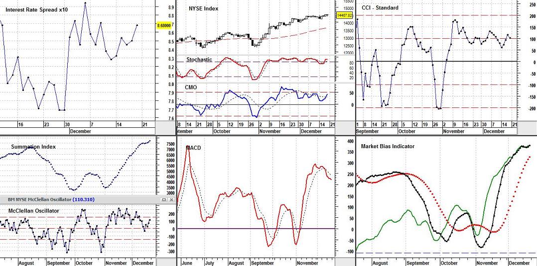
Market Bias Indicator
The Market Bias Indictor (MBI) is useful in evaluating the general status of the market and the nature of any investment strategy shifts that may be necessary to adjust to the prevailing market environment. For example, when the market has a negative bias (as shown by the Market Bias Indicator), it might be wise to move to cash, switch to a fund that goes up while the market goes down, place stop-loss orders on all positions, or to be extra cautious about taking new positions. When the Market Bias Indicator “says” the market is favoring buyers, it is not as likely to punish investor aggressiveness (equity growth is expected).
If the black line of the Market Bias Indicator (the indicator line) is above the blue horizontal line, we believe the market is favoring buyers. That is, the Market Bias Indicator is “bullish” (it is probably okay to hold our positions or to take new ones). In this market environment, ignore the broken red line unless you are an aggressive trader. If you are an aggressive trader, while the black line is in “positive territory,” a move above (or below) the red broken line is a buy (or sell) signal respectively. A rising (or falling) green line must confirm either of these signals before action is taken. The green line is the “confirmation-line” of the indicator. If the black line falls below the horizontal line, we believe the market is favoring sellers. That is, extra caution is in order. The Market Bias Indicator (MBI) suggests a “sale attitude” only if the green line is declining while the black line is in “negative territory” (below the horizontal line). While the black line is in “negative territory,” a move above (or below) the red broken line is a buy (or sell) signal respectively. Again, a rising (or falling) green line must confirm either of these signals before action is taken. The green line will shift its position over time (appearing higher or lower relative to the other lines and the horizontal line). However, the shape of the green line will not change. The relative placement of this line is not relevant. Only its direction is important.
The Market Bias Indicator is sensitive. For example, when we focused it on the Dow back in the 1980’s, it was able to give a “sell signal” two days before the meltdown in 1987. Though it is sensitive, it avoids whipsaws better than most indicators. While there are numbers that determine line placement in this chart, this indicator was intended from the beginning to be a visual indicator only. The story is told by position above or below the horizontal line, not by the exact numbers for the distances. It does not add any more useful information to know that one day it is 25 points above the line and the next day it is 15 points above the line. We can visually determine that it is closer to the line and estimate its rate of approach. The same thing applies to each of the lines in the indicator. Which ones are above or below which others and which direction are they headed are the important issues rather than the quantitative readings for each. We want people to be able to glance at the chart and see a “picture” that tells them all they need to know. We do not even look at the numbers ourselves when we use the indicator. If we ever decide to place the indicator in the public domain, it will be necessary to divulge the equations used and the data needed. However, the indicator is available nowhere else on the planet, and that serves our purpose at this time. Systems and strategies tend to lose their power when they are widely disseminated.
All indicators, including this one, should be used in conjunction with other methods of analysis. Bear in mind that an MBI buy or sell signal is not necessarily a buy or sell signal for individual stocks in your portfolio. These signals are merely indicators of market bias. Individual stocks should always be bought or sold on the basis of their own merit or lack thereof.
MACD
The MACD (Moving Average Convergence/Divergence) is a popular buy/sell indicator. Here it is applied to the broad market (NYSE) because it includes all the stocks on the NYSE rather than just those in the Dow or the S&P500. The MACD is the dark blue line. The “trigger line” is the dotted red line. The latest reading is in the top left corner of the chart (blue). The basic MACD rule is to sell when the MACD falls below the broken signal line and buy when it rises above its signal line. A crossing of the zero line is a confirmation of the signal. The MACD can give buy/sell indications in three ways: signal line crossovers (the indicator is bullish if it is above its broken signal line and bearish if it is below this line), overbought and oversold conditions (the MACD is in an Overbought/Oversold range when it pulls dramatically away from the broken line; when this occurs, it is likely that the market is overextending and will soon reverse direction), and divergences (a bearish divergence occurs when the MACD is making new lows while the market (as measured by the S&P500, or NYSE) fails to reach new lows; bullish divergence occurs when the MACD is making new highs while the market fails to reach new highs (these divergences are most significant if the market is overbought or oversold).
Though divergences can be used as an indicator of a potential trend reversal; they can also be used as an indicator of a trend continuation. When there is an uptrend, a reverse divergence (or hidden bullish divergence) occurs when price is making a higher low, but the oscillator is indicating a lower low. This suggests that the current uptrend is likely to continue. In a downtrend, a reverse divergence (or hidden bearish divergence) occurs when price makes a lower high, but the oscillator is indicating a higher high. This suggests that the current downtrend is likely to continue.
Interest Rate Spread
The Interest Rate Spread chart shows the pattern of change in the spread between short-term and long-term Interest rates over recent months. The last reading (multiplied by 10) is inserted in the scale on the right side of the chart in a yellow box. Simply move the decimal point one place to the left to get the current reading. When the spread between short-term rates and long-term rates is +1.3% to +2% (short-term lower than long-term), the economy is thought to be in for a normal growth rate in the vicinity of 2% to 3%. If the difference is more than that, it is probably because the Central Bank is making money more easily available and the economy will likely undergo accelerated growth. When companies can get cheap money, they can more easily afford to invest in projects, facilities, and equipment that will expand business or improve operations. If the interest rate spread is negative (short-term money more expensive than long-term money, then money is being made more difficult to obtain by the Central Banks (they are attempting to reduce the rate of inflation). This will, of course, slow down the amount of capital investment made by companies. Economic expansion will be mitigated. If the spread is a negative 1.5% (or even more), then the probability is 70% that economic recession will occur within a year. This information can be the basis for some general guidelines. If the spread is negative, make stop losses hug price action more snugly and use other techniques you may be aware of to guard or enhance assets in the event of market decline. If the short-term rate is enough higher that the interest rate spread is -1% or more, cash might be your best option. If the chart indicates that the current spread is .76, then the current spread is a little more than ¾ of 1%. The fact that the number is positive (the line is above zero) means the long-term rates are greater than the short-term rates. If the number is negative (the line is below zero) it means the short-term rates are greater than the long-term rates. a.) If the spread is negative, tighten stops or take other protective measures. b.) If short-term rates are 1% or more higher than long-term rates, cash might be a more appropriate investment (Remember that the bear market that began in 2000 started under these conditions). c.) When the spread between short-term and long-term money is less than 1%, higher-quality growth stocks are better candidates. d.) When short-term money costs 1% to 3% less than long-term money, stocks are generally even more likely to be profitable. A greater variety of stocks will advance in valuations. e.) If the spread is more than 3%, assume that inflation is just around the corner.
Stochastic Oscillator
The Stochastic Oscillator chart above is referencing the NYSE Composite Index. This Index includes all stocks listed on the New York Stock Exchange. The Stochastic Oscillator is a short-term indicator. It can be helpful in estimating when a security (or index) is likely to change its direction in the near future. Most technicians consider it a “buy” signal when the Stochastic Oscillator falls below 20 (a few technicians use 30) and then moves above that level, and a “sell” signal when the Stochastic Oscillator rises above 80 (a few technicians use 70) and then falls below that level. The Stochastic Oscillator can remain above 80 (or below 20) for prolonged periods while the stock or index continues moving to higher (or lower) levels. If the stock (or market) is non-trending (moving sideways confined within upper and lower parallel boundaries), then trades based on overbought or oversold levels should produce the best results. However, if the market is trending upwards or downwards, then the Stochastic Oscillator can be used to enter trades in the direction of the trend. There are also more aggressive traders who consider it a “buy” signal when the blue line rises above the dotted line and a “sell” signal when it falls below it. Also, look for divergences. When the market is making a series of new highs and the Stochastic Oscillator is failing to surpass its previous highs, the oscillator is giving us a warning signal.
The Chande Momentum Oscillator is in the same chart. The use of the Chande Momentum Oscillator (CMO) is similar to that of the Relative Strength Index (RSI). However, the Chande Momentum Oscillator measures momentum directly by combining data for both up and down days in the numerator of its equation (the RSI uses up days only in its numerator). In addition, the Chande Momentum Oscillator or CMO does not have any built-in smoothing that would obscure very short-term momentum extremes (the RSI has smoothing and tends to obscure these details). The black solid line is the zero line. The dashed horizontal lines in the chart mark the -50 and +50 levels of the indicator. The Chande Momentum Oscillator indicates overbought (+50) and oversold (-50) conditions. For example, at -50 the downside momentum is 3 times the upside momentum, and at +50 the upside momentum is 3 times the downside momentum. These levels are extreme and tend to be followed by a reversal of the Index (though the reversal may not be immediate). The Chande Momentum Oscillator can also be used to measure the degree to which the market is trending. The more extreme the CMO, the stronger the trend. A low CMO reading close to “0” indicates the market is neutral or in a sideways trading range.
The Chande Momentum Oscillator can help establish entry and exit points when used in conjunction with a trend-following indicator, such as a movng average. For example, if a moving average has turned positive, you could enter the market when the Chande Momentum Oscillator is advancing (the CMO, unlike a moving average, does not lag the market) and exit when it moves lower or when the moving average gives a sell signal. The moving average can be used to define a buy or sell bias, and the CMO can function as your “trigger.” Finally, look for divergences between the action of the Index and that of the CMO. For example, if the Index is making a new high (or low) and the Chande Momentum Oscillator is failing to surpass its previous high (or low), the CMO is “anticipating” a reversal in the Index. The CMO in the chart is based on 14 days. The dotted black line is the 10-day simple moving average of the CMO. This line can aid in initiating a trade before the CMO crosses the zero line. For example, a person could buy when the CMO crosses above the average instead of waiting for it to cross zero. He could sell when the CMO crosses below the average. Just be aware that this approach can give premature signals.
Commodity Channel Index or CCI (NYSE Composite)
The Commodity Channel Index (CCI) measures the deviation of a security’s price from its statistical mean. The above chart is the 20-day CCI. High readings indicate that prices are relatively high in comparison to average prices, and low readings indicate prices are relatively low in comparison to average prices. The name of this indicator is somewhat misleading, since it is not limited in its usefulness to only commodities. It can be used with any security. Traders often check the CCI to see if there is divergence between it and its underlying security. They also use it to detect overbought and oversold conditions. If the Dow is making new highs but the CCI is not, for example, then the Dow is likely to undergo a correction. The CCI usually ranges between +100 and -100. If it is above +100, the underlying security is considered to be overbought. If it is below -100, the underlying security is considered to be oversold.
Lambert designed the CCI so that approximately 70 to 80 percent of CCI values would be between -100 and +100. Therefore, a move that takes the Index outside this range indicates unusual strength or weakness that can be a prelude to an extended move. Think of these levels as indicating a bullish or bearish bias. Some consider the CCI to be favoring the bulls when above zero and the bears when it is below zero. The problem with this is that depending only on a cross of the zero line to determine a bullish or bearish disposition can subject a person to many whipsaws. Requiring a move above +100 for a bullish signal and a move below -100 for a bearish signal will reduce whipsaws but result in slower entries and exits. Many traders consider this to be a small price to pay for a higher probability of being on the right side of a trade. There is much more to the CCI than this. The CCI is a powerful analytical tool. For a much more thorough discussion of the CCI (trading with it, signals, and interpretations), see Tutorial 13.
McClellan Oscillator & Summation Index
The McClellan Oscillator is a breadth-of-market indicator that is effective for interpreting short-to-intermediate-term market moves. The McClellan Summation Index is a running total of each day’s McClellan Oscillator value. The Summation Index is effective for interpreting intermediate to long-term market moves. Together, they can be useful in evaluating the dynamics of the ebb and flow of the market, and in planning entry and exit points. The readings posted depend on the precise time the readings were taken. For example, after the market officially closes, stock prices may continue changing by small amounts for a short time as computer systems catch up with closing activity. Readings at the official closing time may be slightly different from those 15 minutes after the close. Thus, different sources may report slightly different readings.
McClellan Oscillator readings of ±150 are extreme and tend to correlate well with buying and selling climaxes in the market. The McClellan Oscillator reaches these extreme values, measuring overbought and oversold conditions, in advance of market turns. It then passes through zero at or very soon after market turning points (to put this in perspective, extreme readings occur much less frequently than a pass through zero. McClellan Oscillator passes through zero tend to indicate market reversals at approximately 2 to 6 week intervals). The type of action to be taken, if any, depends on the major trend of the market (as indicated, for example, by 50 and 200-day moving averages) and on whether the move originated from an extreme reading. Thus, in the early and middle phases of a bull market emphasis might best be placed on buy signals. In a bull market, buy signals occur earlier, and positions can be taken when the McClellan Oscillator clearly moves out of its basing pattern, even if it is still negative. In a bear market, sell signals occur when the oscillator moves clearly out of a topping formation, even if it is still positive. The amplitude of the oscillations above and below zero correlates with the general volatility of the market. The oscillator shows distinct cycles (lasting 22 to 24 weeks) between significant bottoming formations. Divergence between oscillator moves and conventional market indicators forecasts an impending change in market direction. Conventional trendline theory can be applied to oscillator patterns. For example, a triple top formation in the McClellan Oscillator forecasts a termination of the preceding up-trend.
The Summation Index is a relative number, depending on the day when the count begins. Therefore, on one day it might read 10,000 and the next day it might read 9,000 even though the chart shows the Index rising. In this case, the apparent discrepancy would simply be the result of the summation starting on a later day for the chart selected. You can get a better sense of what is going on by simply looking at the chart. Ask yourself questions like the following. Is the Summation Index rising or falling? Are the postings far apart or close together? For example, if the Summation Index is rising (or declining), it is intermediate-term bullish (bearish if declining) and the market’s trend is up (down if the Summation Index is declining). If the Summation Index is declining, the first positive sign will be a slight narrowing of the gaps between postings. The second positive sign the Summation Index will give is a flattening out of the entries (this stage is sometimes skipped). The third positive sign is a reversal in direction. The final positive sign is a slight increase in the distance between postings. Some investors use the latter as a buy signal (alternatively, some may use the second posting in the new direction as an early buy signal). They view the opposite conditions as negative, culminating in a sell signal. Because of their sensitivity, the declines and advances of these indicators can appear to be much more extreme than the actual movements in the market.
The above charts may take on a different appearance at times. That’s because we use several sources, and when one is late in getting the data out we may switch to another source. Some charts have the numbers 19 and 39 at the top. Those are simply the exponential moving averages used in the computations, and should be ignored.
Gold & Silver Spot Prices
Today’s Action & Last Spot Bid Prices


Chaikin Relative Volatility and CBOE Volatility Index (VIX)
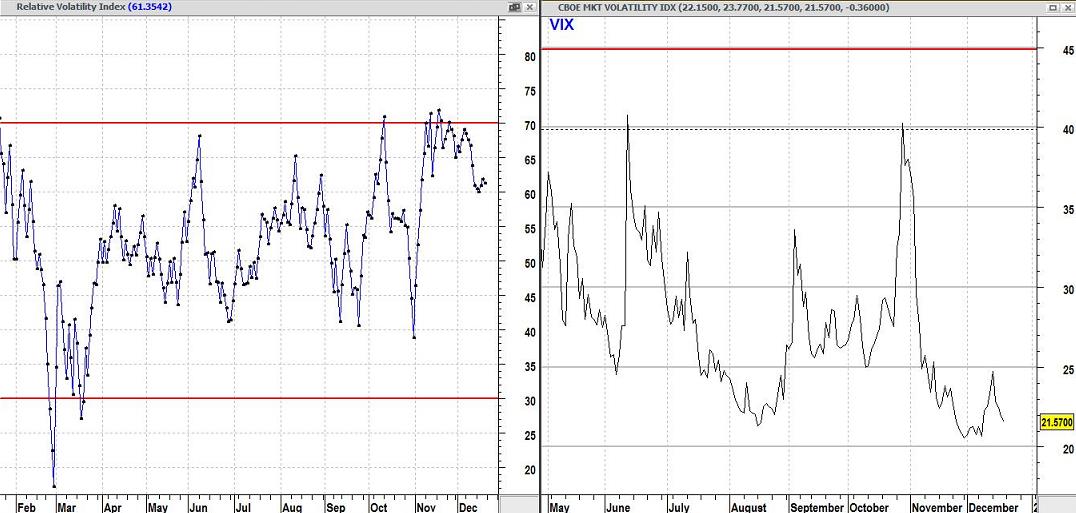
The Chaikin Volatility Indicator is shown above on the left. It is based on the S&P100. This indicator calculates the 10-day moving average of the difference between the high and low for each day and then computes the percent rate-of-change of that moving average over the last 10 days. The premise is that a widening of the range between the daily high and low indicates an increase in volatility. Some believe that market tops are associated with an increase in volatility (because investors are expressing nervousness due to their increased internal conflict between fear and the desire for more gain). Market lows are supposed to be associated with relatively low volatility because investors have been disappointed so often that they don’t expect much. Mr. Chaikin looks at it differently. He believes that if his volatility measurement indicates there has been a significant increase in volatility over a short time that a bottom is near (because it is a 10-day measurement, it is sensitive to a panic-like selling climax). He also believes that a gradual decrease in volatility over a long time is what you should expect as a bull market ages and approaches a top.
The VIX (shown above on the right) is a measurement of “implied risk” and differs from the other measurement in that it is not a direct measurement of price volatility. The VIX is related to the demand for puts and calls and their prices. Traders associate readings above 45 with investor fear. At these levels, we tend to see capitulation selling. People are giving up what remains of their positive attitudes about the market. This is seen as positive because it often means the market is bottoming. A reading of 30 is associated with high volatility (there is heightened fear and uncertainty in the market). Readings in the range of 20 to 25 are usually associated with a casual nonchalance on the part of investors. Readings below 20 tend to correspond to a lack of investor “enthusiasm” (the market may be nearing a top). In general, the VIX tends to increase as the market declines and decrease when the market is rising. Why? When the market is rising, it is believed to be less risky but more risky if it is on the way down.
We Test Common Assumptions Of Market Participants
We test assumptions commonly made by market “gurus” to see if they are valid. On the Q & A page (item 14), we explain why we use the Dow rather than the S&P500 in our analysis, even though it consists of only 30 stocks. Another example is that a lot of people who like to consider themselves expert traders/investors, prefer exponential moving averages over simple moving averages. It is part of the “popular wisdom” of the market that exponential averages are better than simple averages because of the greater sensitivity of exponential moving averages to the most recent price behavior. However, few have really conducted more than superficial tests of the assumption that exponential is better than simple. It turns out that the very fact that they are more sensitive to recent price action can actually be detrimental. Like nearly everything else that really works in the market, the truth is counter-intuitive. We have rigorously tested the profitability of simple against exponential averages. After conducting thousands of tests on thousands of stocks in large databases using every moving average from 3 days to 200 days, and testing them over decades of market behavior, we have proven to our satisfaction that the simple moving average is just as good if not better than the exponential moving average as a signal generator (in terms of bottom line profitability). Any gain in sensitivity of an exponential average can often be more than compensated for by simply using a slightly shorter simple moving average. Often the simple moving average allows more time for momentum to build in support of a signal before the signal is actually given, and that often results in fewer whipsaws or false signals. Please do not get the wrong impression. Generally, the differences were not major, and sometimes exponential averages worked better. However, we were trying to determine which worked best most of the time on most stocks in most types of market environment. Our general observation is that being faster on the trigger is not necessarily better. Our studies confirmed the studies conducted by Merrill Lynch in 1978. Those studies showed that simple moving averages were superior to exponential moving averages. For more on the nature of our testing procedures, see our report on selling strategies (a link at the end of the report leads to a report on the Merrill Lynch study). Sell Strategy See also Item #11 at Q & A